The 2023 Women’s World Cup in Australia and New Zealand is a race to lift the trophy, sure. But just because your team is going all out to win doesn’t mean they can’t look while they’re doing it.
England, France, Germany and defending champions the United States all arrived among the favourites to win the tournament, but it’s a level playing field for all 32 nations from six continents when it comes to who has the best kits.
From Argentina to Zambia, those 32 countries are vying for glory in the sartorial stakes, with an array of home and away jerseys inspired by such diverse concepts as natural splendour, ancient art, comic books and even cobblestone pavements.
Here’s a rundown of the kits that will be shown during the tournament, an overview of their designs, and a definitive ranking of them all from No. 32 to No. 1.
– Stream on ESPN+: LaLiga, Bundesliga, more (U.S.)
– Women’s World Cup: Schedule | Rosters | News
Zambia were forced to cancel a contract with their previous kit supplier five years ago and instead set up KoPa, their own in-house producer. As Football Association of Zambia president Andrew Kamanga puts it, this novel approach is “a true testimony that local brands can grow if well supported.” Unfortunately, neither the orange home kit, green away jersey nor white third alternate offer much to make them stand out at the World Cup.
The kits Las Ticas will wear are classically styled but ever so dull as a result. The home jersey is a straightforward red base with blue-and-white trim to reflect the colours of the nation’s flag, while the pinstripes on the white away shirt aren’t nearly enough to make it memorable either.
30. Panama (Reebok)
While hardly bound to set the tournament alight, the honeycomb graphic on the Panama home shirt does offer some visual appeal. However, that level of mild interest cannot make up for the unforgivably boring white away jersey.
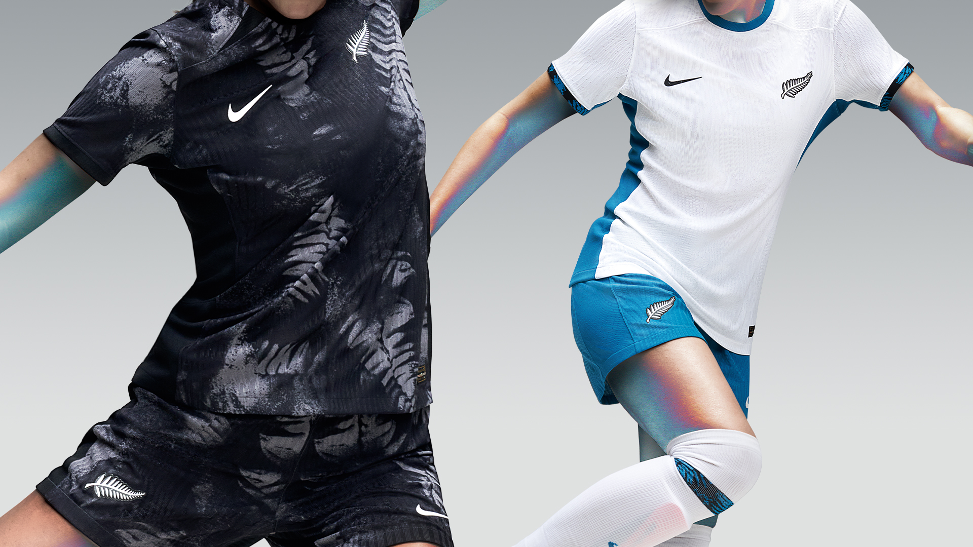
The World Cup co-hosts have failed to set the standard as far as the tournament style is concerned, with their home shirt in particular falling way short. The black shirt is covered in a mottled fern print that makes it look like it was last worn to paint the living room.
Inspired by the kit worn by the New Zealand squad that qualified for the inaugural 1991 World Cup, the away jersey is much cleaner. The simple, ice-white design is accented with vivid blue trim, highlighting just how overwrought the home shirt is in comparison.
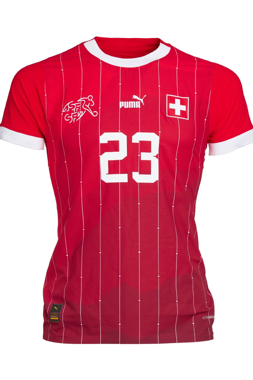
Predictable fare from the Swiss, who have opted for a red home kit with white trim that is almost indistinguishable from their previous outfits. The pinstriping and subtle graphic across the torso inspired by the Swiss Alps does at least save the design from being totally generic. Puma is yet to release a new away jersey for the Swiss team, so they could yet move up (or down) the ranking.
27. Vietnam (Grand Sport)
Smart and sleek without any grand embellishment, both Vietnam home and away shirts feature fine patterns in the fabric. The home motif is a wallpaper design based around the star at the centre of the national flag.
The pattern running through the away shirt is a light gray marble graphic on a white background, which help to make the red collar and sleeve cuffs pop.
26. Haiti (Saeta)
All three of Haiti’s 2023 World Cup kits feature the same faint repeating pattern comprising a diamond shape made up of the letters in the name of the country and a fleur de lis. The latter is based on the embellishments found on the Cathedral of Our Lady of the Assumption in the southern port city of Les Cayes.
The away kit is a straightforward white inversion of the blue home kit, while the third shirt is a near-identical red rendering of the same basic design.
Using the same template for all of your kits can be a risky move, but Haiti just about get away with it.
Banyana Banyana use the same colour palette for both of their jerseys. The home kit is yellow with green detailing and a subtle abstract print design.
The away shirt flips that around, making the pattern inspired by vibrant African art and the national philosophy of “Ubuntu” — a spirit of unity and togetherness among all people — more visible.
An interesting array of colours and designs from the Philippines, with the blue home jersey probably the least memorable of their three kits.
The away kit has an interesting meshed stripe pattern over a white base making the yellow collar and blue shoulder stripes stand out.
The red third alternate shirt is another appealing, well-balanced design, with yellow pinstripes and blue trim on a red base.
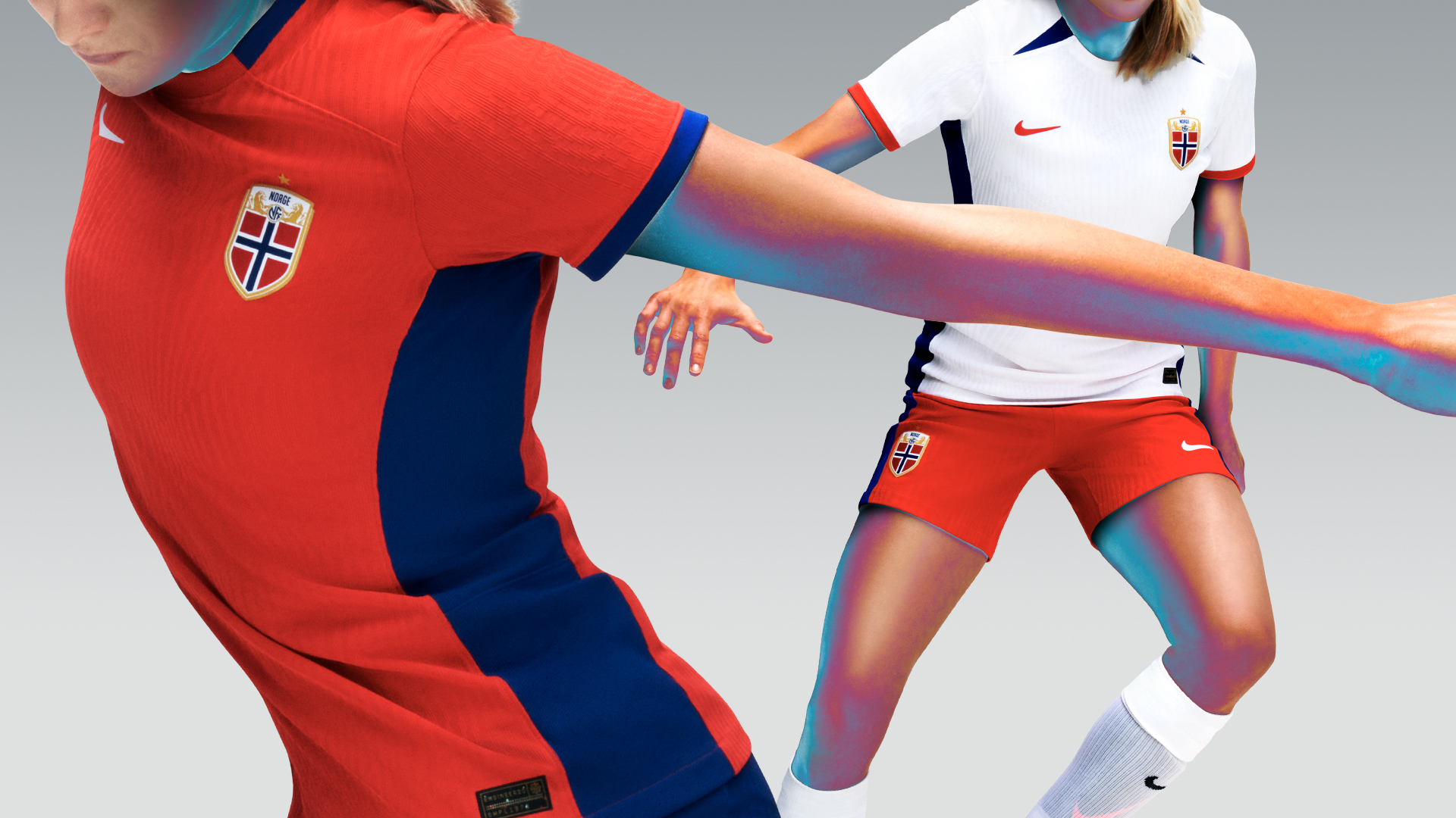
The home kit is a simplistic red design with trim made up of the other two colours, blue and white, found on the Nordic nation’s flag.
Theys are flipped around for the white away shirt, which is accentuated by blue flank and shoulder details and red cuffs. Though unfussy and functional, both Norway jerseys lack visual flourish.
22. China (Nike)
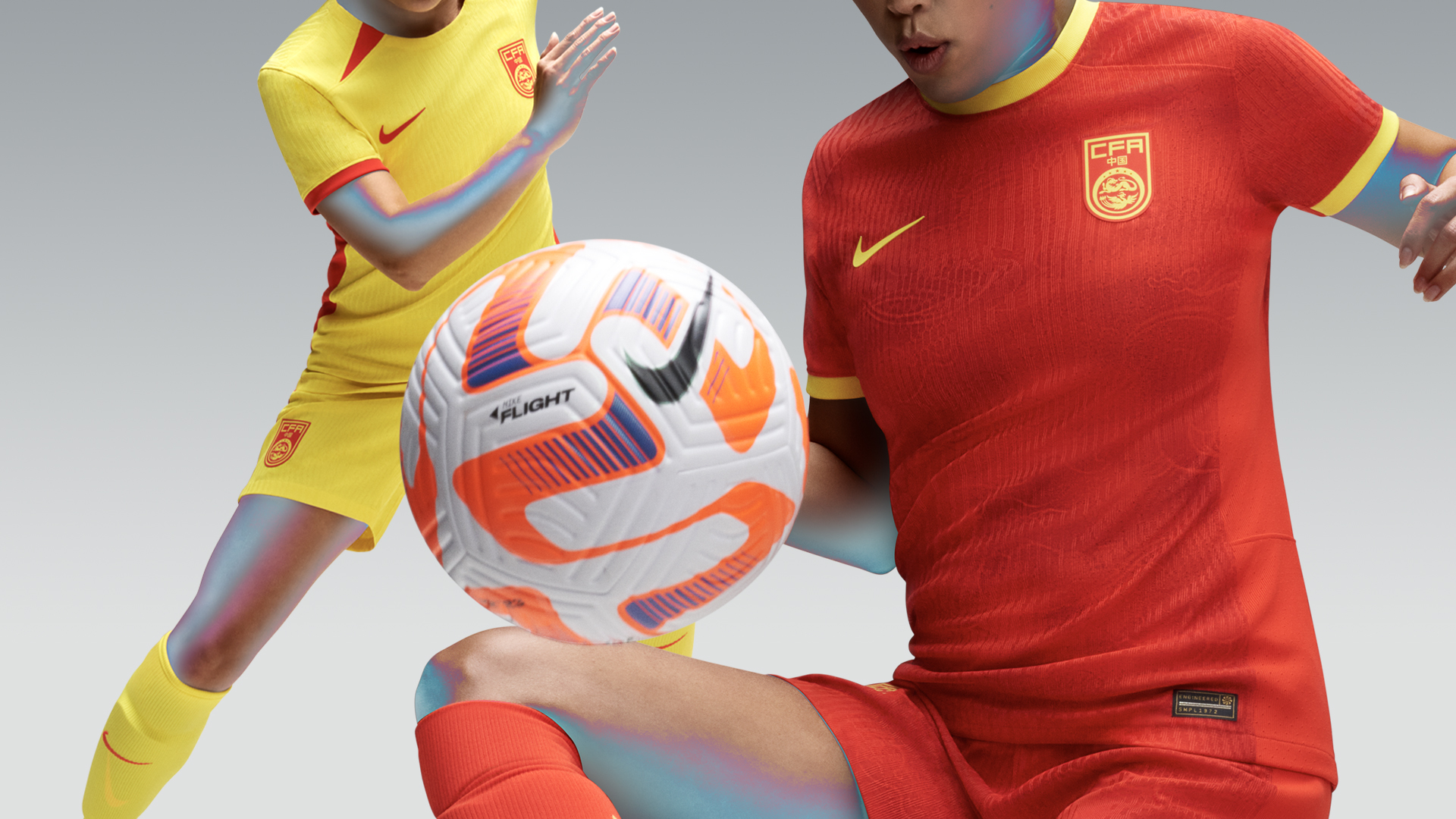
China’s home shirt is resplendent in the national colours of red and yellow and also features an ornate print woven into the fabric that is inspired by a Xiangyun pattern — clouds that are associated with good luck.
The away kit is the standard Nike colour and template flip, with the yellow and red inverted to create a no-frills jersey.
Anyone else feeling excited for FIFA Women’s World Cup 2023? 😁 pic.twitter.com/WGBpO6AHIu
— FAI Women (@FAIWomen) June 13, 2023
Competing in their first Women’s World Cup, the Republic of Ireland have played it safe, sartorially speaking. When your nickname is the Girls In Green, it’s best to not mess around with your home jersey.
The vertical pinstripes of the home shirt are flipped horizontally for the away kit, and once more the effect is simple yet effective enough.
قميص جديد، تحدي جديد، هل أنتم مستعدون؟
🇲🇦 Morocco in #FIFAWWC 2023 : New jersey, new challenge, are you ready for more ? 🔥#DimaMaghrib #OneGameOneFamily #AtlasLionesses pic.twitter.com/oUJ7BQnT2O
— Équipe du Maroc (@EnMaroc) June 23, 2023
The home shirt is solid red with diagonal tonal stripes across the front that give the impression of claw marks — possibly in reference to the team’s nickname of the Atlas Lionesses. The chunky V-neck is green to complete the national colour palette while the logos are regal gold. The country’s name is also spelled out in Arabic across the back of the collar.
Puma is yet to unveil a new away kit for the team, so they may well be using the same jersey design that the men’s team wore at the 2022 World Cup.
19. Italy (Adidas)
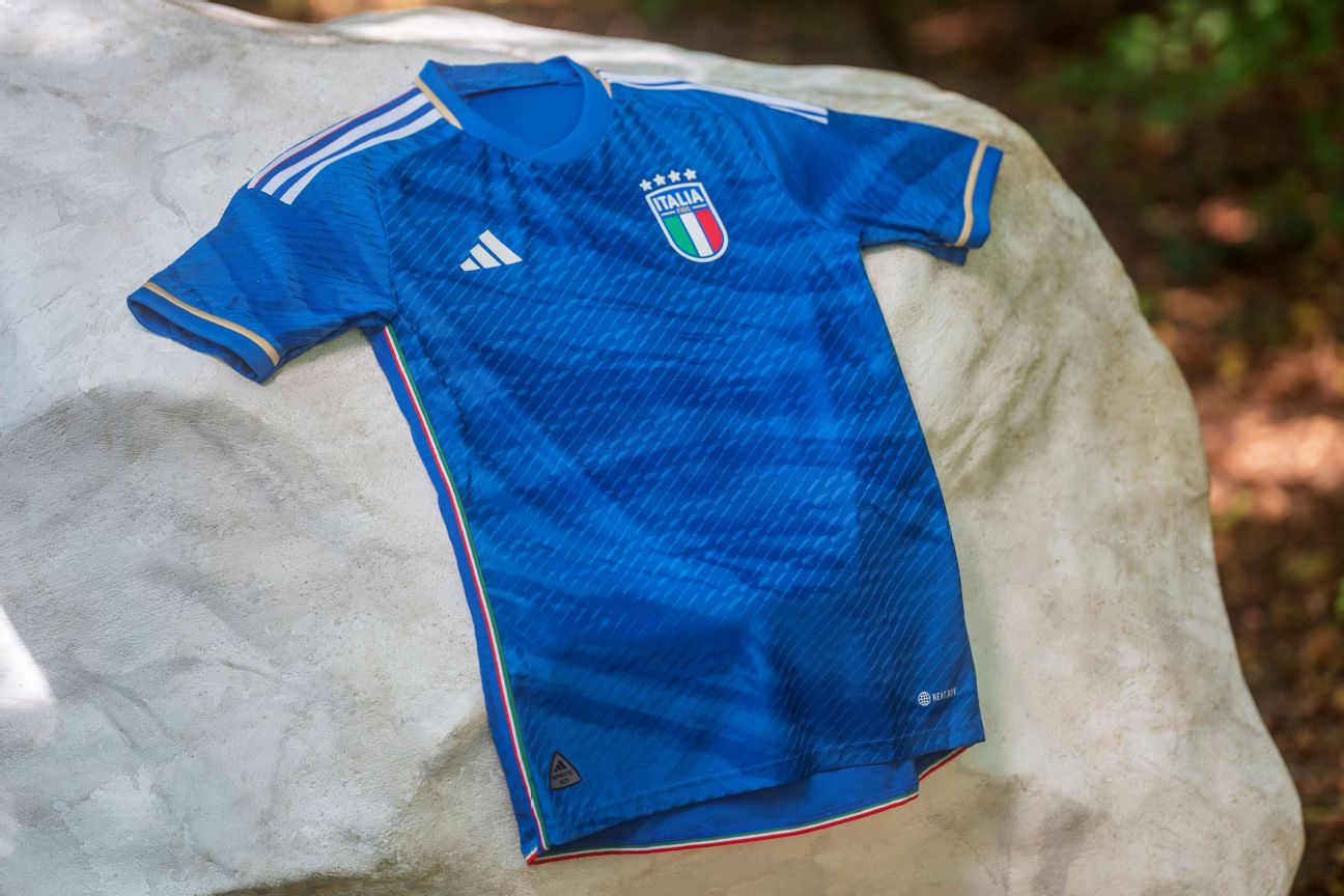
Unveiled in January, Italy will be wearing the first set of kits under their new deal with Adidas. The home shirt is a wishy-washy blue design inspired by historic marble statues and classical architecture, though the effect isn’t wholly convincing.
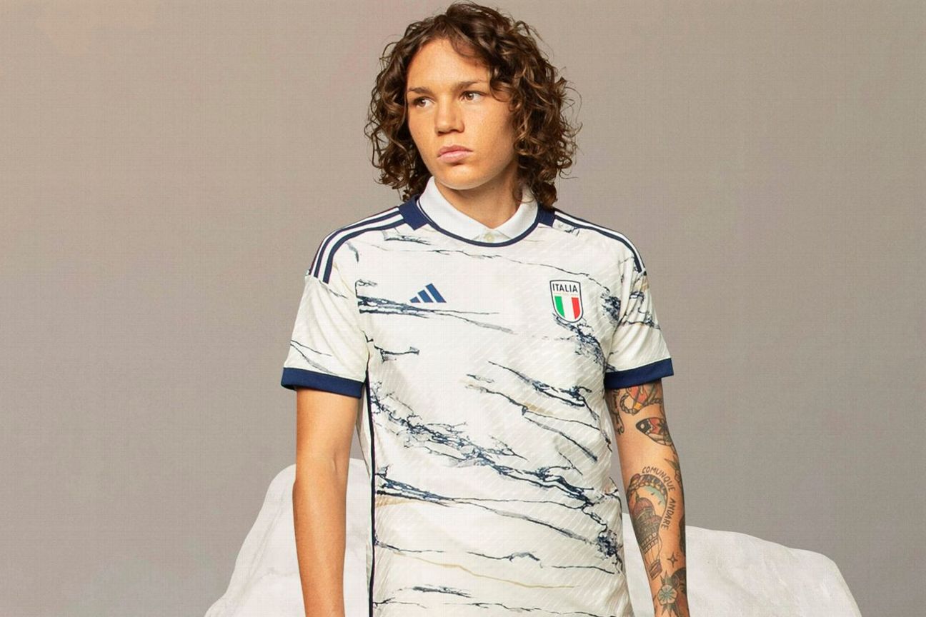
The marble influence is more keenly evident on the white away shirt, which has deep-blue markings running through it like a particularly ripe slice of Stilton. In truth, neither Azzuri kit really hits the mark, and the away shirt is actually a bit of an eyesore when looked at in isolation.
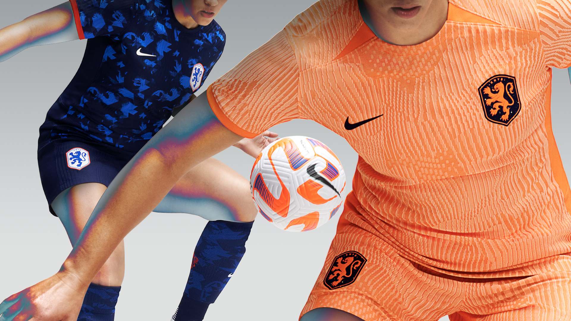
As you might have guessed, the Netherlands will play in orange at the World Cup, though their 2023 kit is definitely not one of their best. The shirt and shorts have a strange two-tone contrast in the weave of the material that gives the fabric a waxy sheen in certain lights.
The away kit isn’t much better, with the Dutch once again using their alternate jersey to fly the three colours — white, red and blue — found on their national flag. The shirt is predominantly dark blue and covered in an indistinct light-blue print that feels more like randomly generated AI art than anything more meaningful.
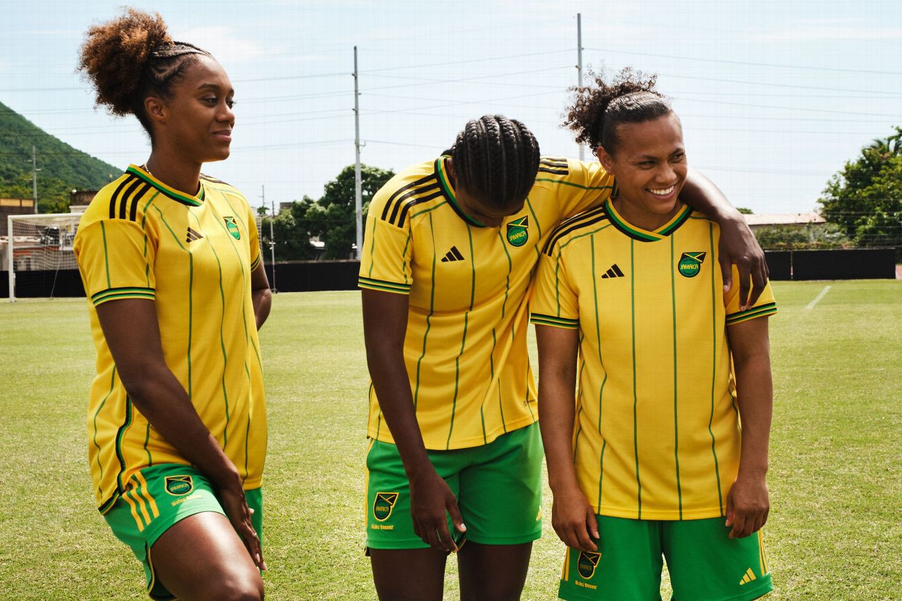
Designed in collaboration with Wales Bonner, an English fashion designer of Jamaican descent, the Reggae Girlz will be wearing a lovely 1980s-infused kit at their second-ever World Cup (they also qualified for the 2019 tournament.) The Caribbean island’s vibrant national colours of yellow, green and black are represented in all their glory on a shirt that also features oversized cuffs and collars, plus a little dash of contrast pinstriping.

That same colour palette is used on the simpler black away jersey, with the addition of a rich red on the collar and sleeve details.
16. Sweden (Adidas)
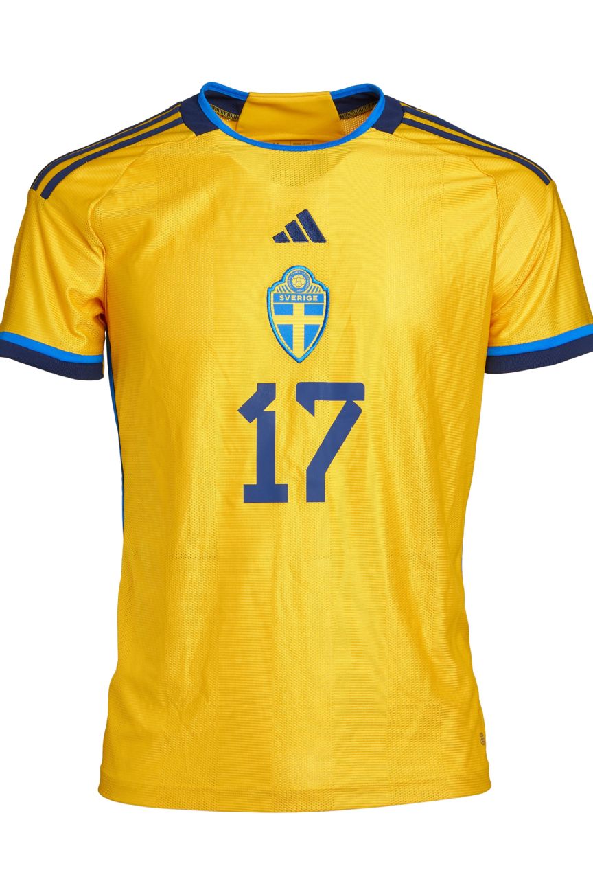
Sweden’s home kit was released n 2022 ahead of the men’s World Cup, which they failed to reach. Inspired by a design dating back to 1994, the yellow shirt is fairly straightforward with a central badge and two-tone blue trim.
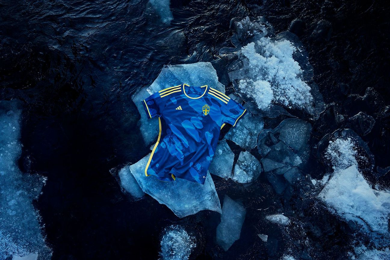
The away kit is perfectly serviceable but also arguably represents the least captivating of Adidas’ nature-themed alternate jerseys, featuring a deep-blue design inspired by the magnificent ice caps, fjords and ancient glaciers of the Scandinavian nation.
Hummel has really branched out with their kits for Denmark. The red home jersey features comic-book elements like jagged speech bubbles and the dotted patterns used in the printing process, all separated by sharp lines as though they are panels in a graphic novel. The white away shirt is a straight reverse of the home template, except with a rounded collar. On this version, the flank and sleeve details draw the attention. These kits are just a little different and all the better for it.
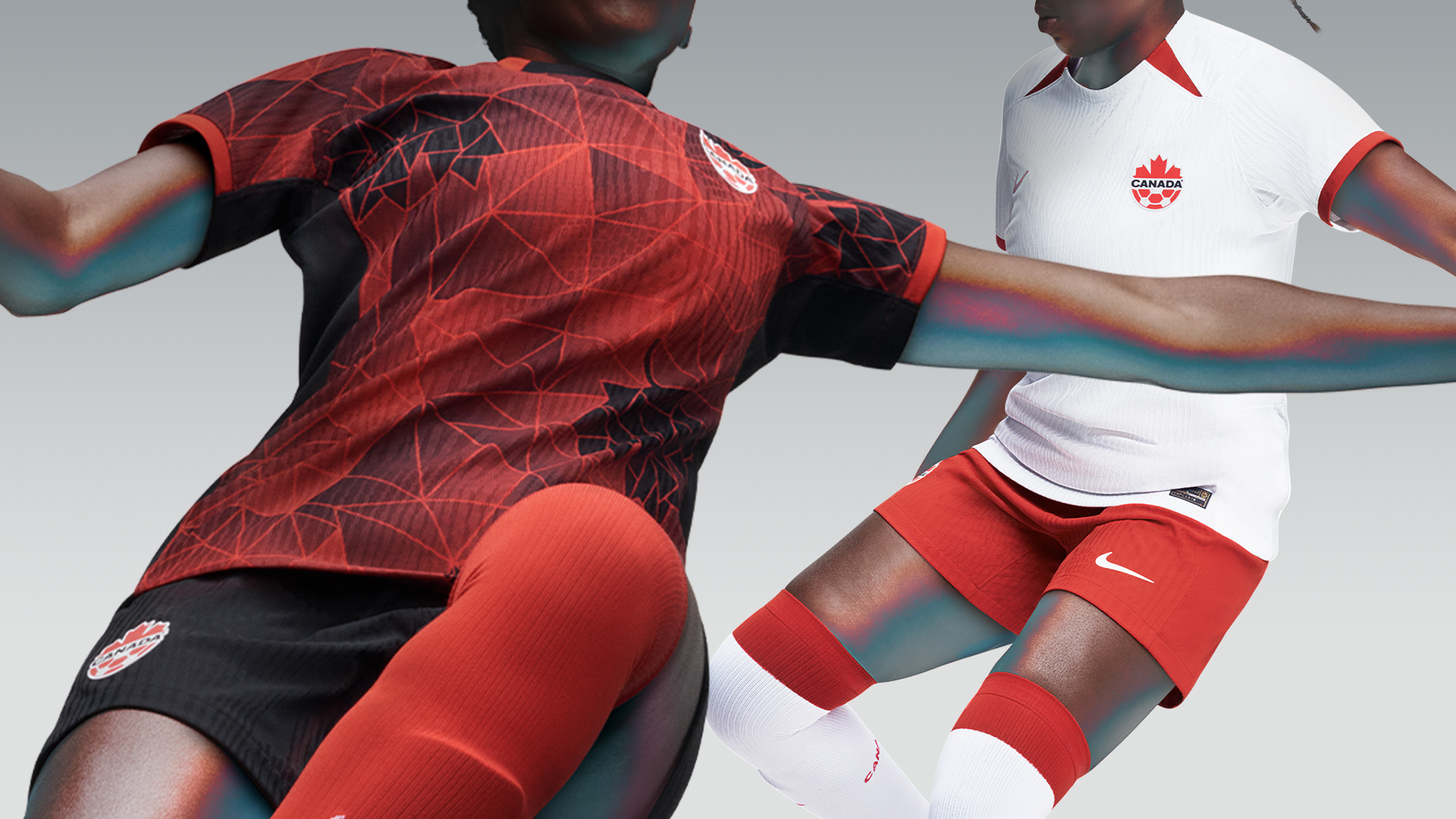
With a distinct sci-fi edge, Canada’s home shirt features a grid of angular red lines that form a geometric abstract pattern inspired by the fronds and prongs of the symbolic maple leaf found on the federation crest.
The same dynamism doesn’t extend to the away kit, which is a serviceable variation of a basic Nike template, which feels like a missed opportunity.
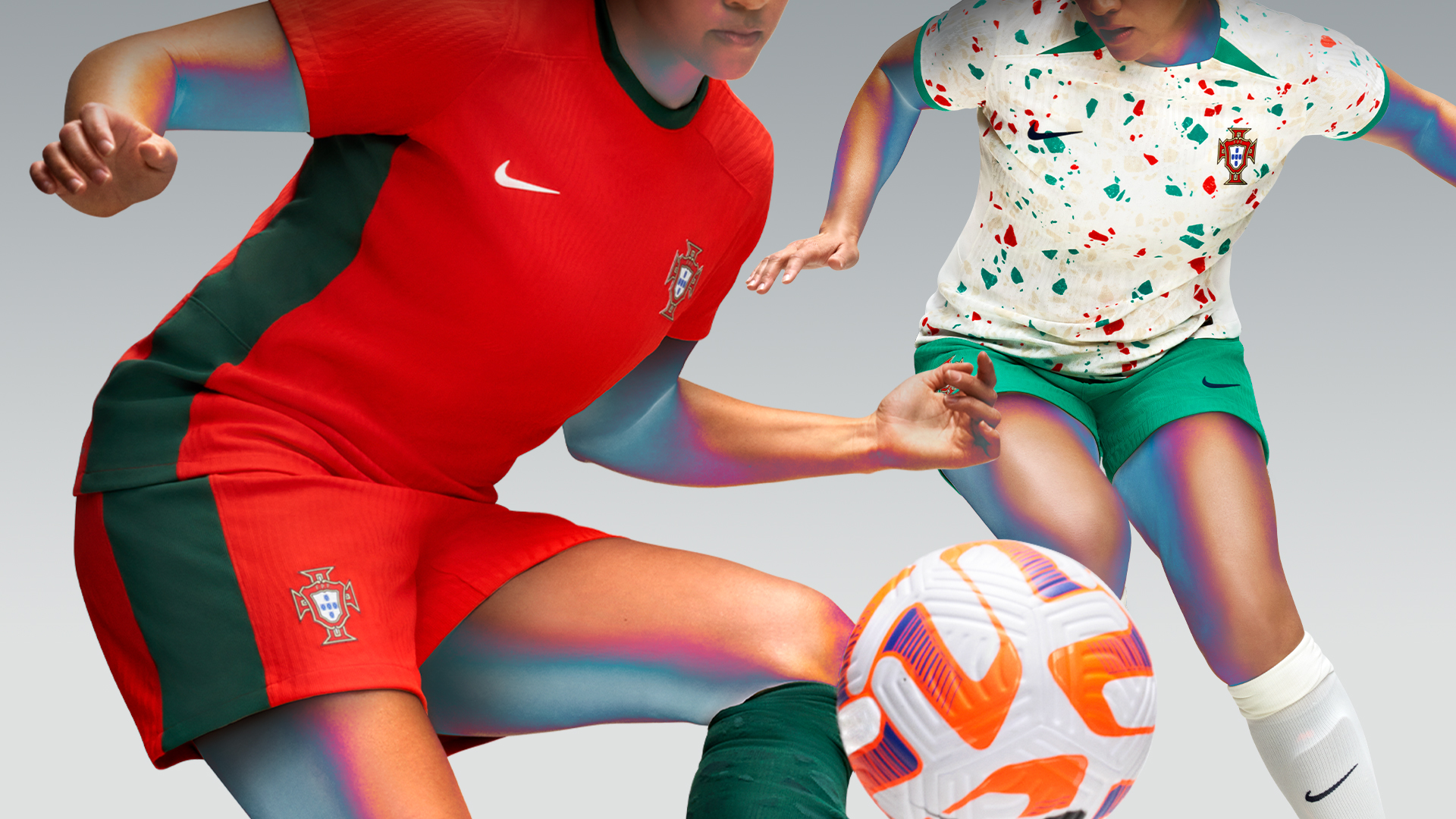
Having been a little more experimental in recent years, Nike returns to safe ground with their 2023 Portugal home kit in which the national colours of red and green are presented in fairly formulaic fashion. According to the manufacturer, the shirt reflects various aspects of the country’s culture: modern art, fashion, maritime history and traditional artisan craftsmanship — which is a lot to read into a pretty basic design. Still, the green band down the flanks extending to the shorts is a nice touch.
Thankfully, the away kit fuels the imagination. The stunning cracked-and-speckled pattern is inspired by “calcada Portuguesa” (Portuguese paving), a cobble technique used to decorate pedestrian areas in towns and cities all over the nation.
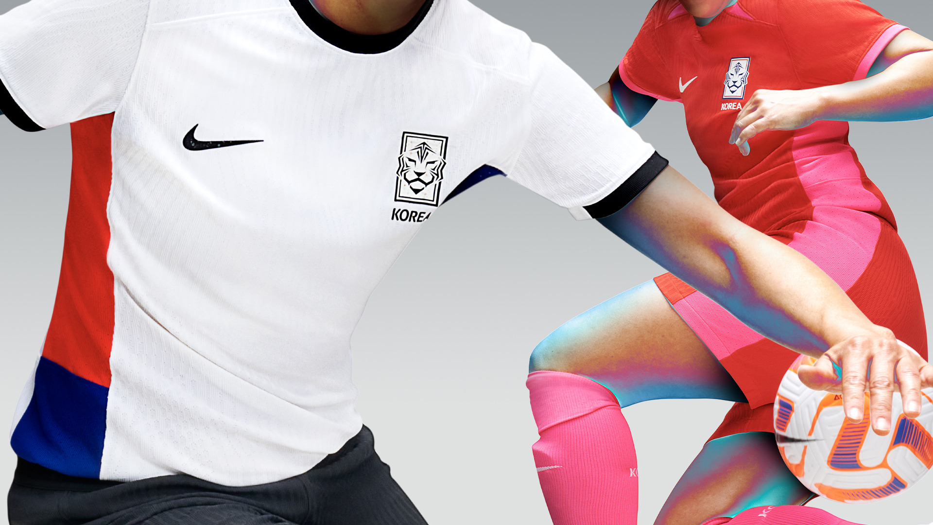
South Korea’s kits are both standard Nike template jobs, although the colour choices go some way to making up for that lack of distinctive design. The home jersey is red with neon pink trim, a colour clash that comes off well.
While the white away shirt is more sedate, the red and blue blocks down the sides work well. Let’s hope we see more of that two-colour approach from Nike in the future.
Colombia will not have a new home kit for the 2023 World Cup and will instead play in the one released last year — a warm, hazy yellow number with minimal extraneous trim or embellishment.
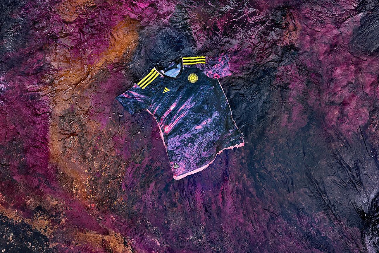
The away jersey, however, is brand-new. And it is something. Adidas says it is a visual ode to the magnificent Cano Cristales River, which is known colloquially as “the river of five colours.” The psychedelic pink-and-purple pattern imitates the shifting hues of the river that appears to turn red, pink, yellow, green and blue throughout the year as different light conditions affect the aquatic plant life that grows under the water.
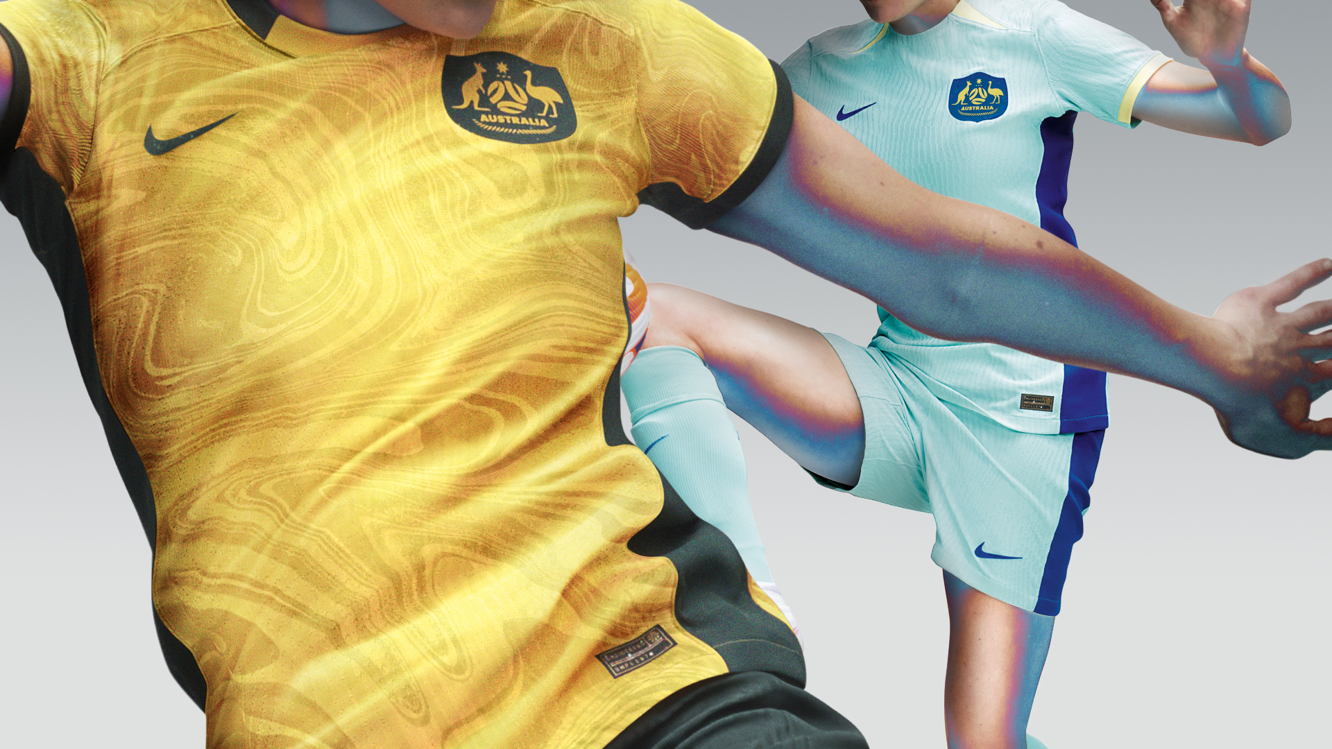
Faring much better than their co-hosts on the kit front, Australia will take to the field wearing a shimmering gold-and-green jersey with a swirled marble effect. Nike’s design blurb informs us that the ripple is supposed to represent both all aspects of Australia’s diverse culture and the progress being made by their women’s national team.
The beautifully bright turquoise away shirt, meant to illustrate a future-facing nation full of vibrant energy and progressive thinking. is one of the nicest colour combinations on any of the Nike kits on show here.
9. Spain (Adidas)
Spain’s home kit, which was released last year, features all the national colours in a tidy, timeless design that is immediately recognisable.
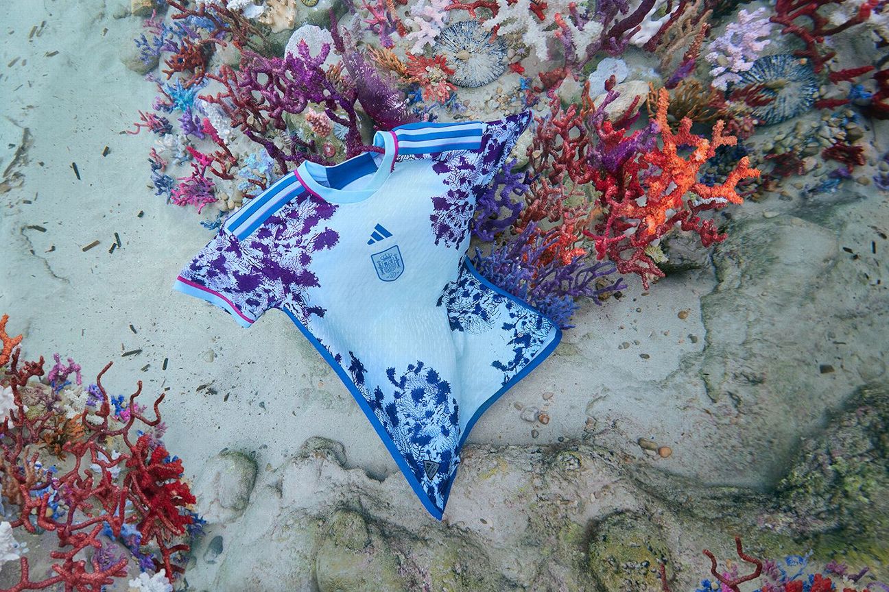
Their much more vibrant away kit is another of Adidas’ natural splendour designs. The shirt is a celebration of marine flora, reflecting the idyllic pale azure of the Iberian Sea as well as the vivid purple coral reefs that fringe the coastline. It is a dazzling design that stays just this side of garish.
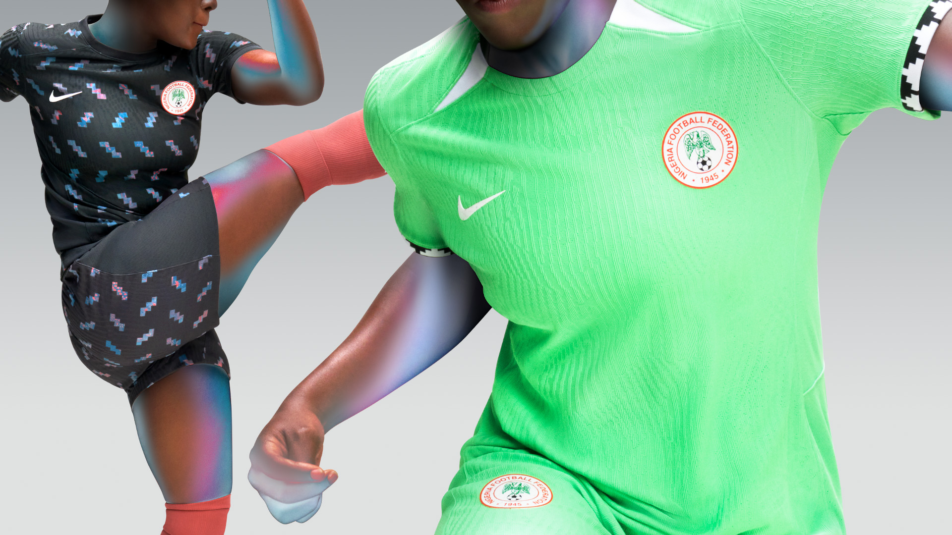
More simplistic than many of Nigeria’s recent kits, the 2023 home shirt is a beautifully bright green (which Nike calls “electric green.”) The pattern on the cuffs and the sock ribbing, inspired by traditional hand-woven textile designs, adds some nice contrast.
The away kit is a real standout with the darker forest green jersey once again carrying references to traditional African prints and textile art in the contrasting zigzag graphic. Just to cap it all off, the socks are a wonderfully warm coral colour.
Argentina will be wearing the same home jersey as that was sported by Lionel Messi & Co. when they won the men’s World Cup in Qatarr. It’s hard to go wrong with the Albiceleste‘s iconic stripes, but this is a particularly good example.
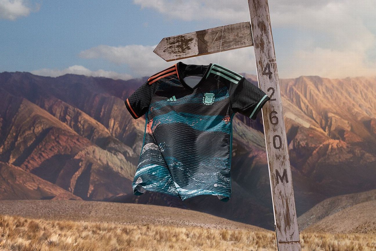
With craggy bands of teal, orange and white, the away jersey is intended to represent the striking mountainous landscapes of the South American country — from the dusky pinks of the Serrania de Hornocal range in the north to the snowy peaks of Ushuaia down south in Tierra del Fuego.
Again, Adidas has furnished Germany with the same home jersey that was worn in Qatar. This sharp white, black, red and gold jersey will have last year’s European Championship runners-up looking sharp as they aim to go one better this time.
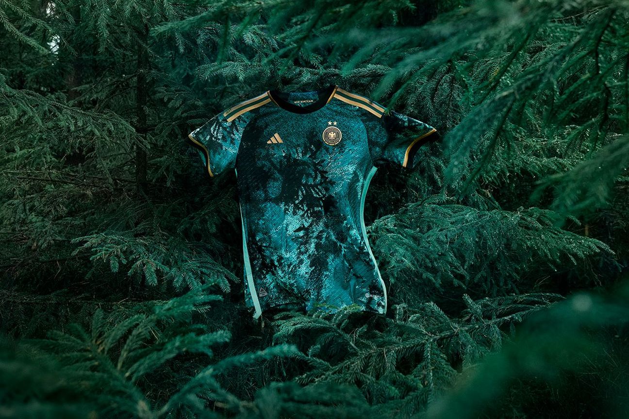
The Frauenteam‘s sumptuous new away shirt is inspired by the country’s dense woodland, namely the Zauberwald (Magic Forest) and mountainous Schwarzwald (Black Forest) located in the southern states of Baden-Wurttemberg and Bavaria respectively. The deep-green hues and thickets of swirling leafy print hint at the foliage and canopies of the forests that combined cover an area equal to almost one-third of Germany’s total land mass.
5. Japan (Adidas)
The Japan men’s team looked great in this jersey, with its interesting white triangular print inspired by the ancient paperfolding art of origami, so it’s great we get another chance to see it grace a tournament.
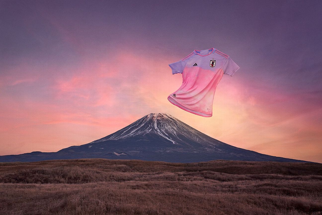
With a gorgeous pink-and-lavender gradient design, Japan’s away kit is a pastel-toned tribute to the spectacular blushing cloud lines witnessed at sunrise above Mount Fuji — the Asian island nation’s highest peak at over 3,700 meters, and an ancient sacred spiritual site for both Shintoism and Buddhism.
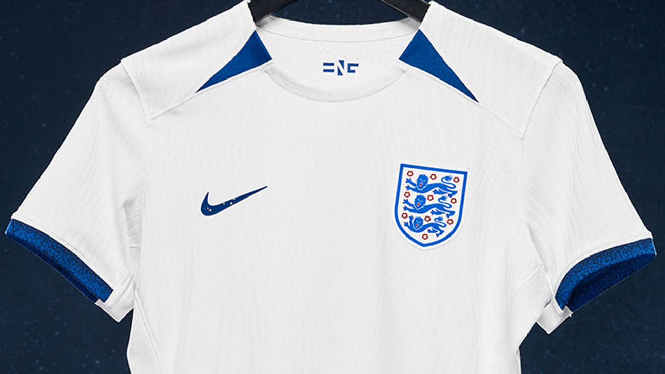
The designs of both of England’s 2023 World Cup kits are informed by the art-deco movement of the 1920s. The home kit is smart and steeped in history. The precise off-white hue of the home shirt is intended to replicate the chalk bricks used to clad the old Wembley Stadium’s exterior. The deep, flat blue of the trim is a nod to the 1984 England women’s team, who played at their first major tournament that year — the European Competition, where they narrowly lose to Sweden in the final.
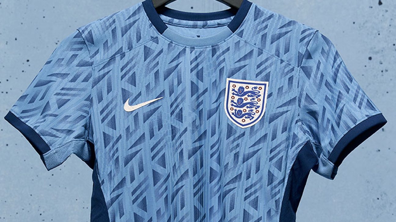
Meanwhile, the away jersey is a much more obvious celebration of the art-deco style, with a pale blue shirt covered in a geometric motif directly influenced by the old Wembley facade. There are also shades of several classic England away kits of the late 1980s and early ’90s, which always brings on pangs of nostalgia for fans of a certain vintage.
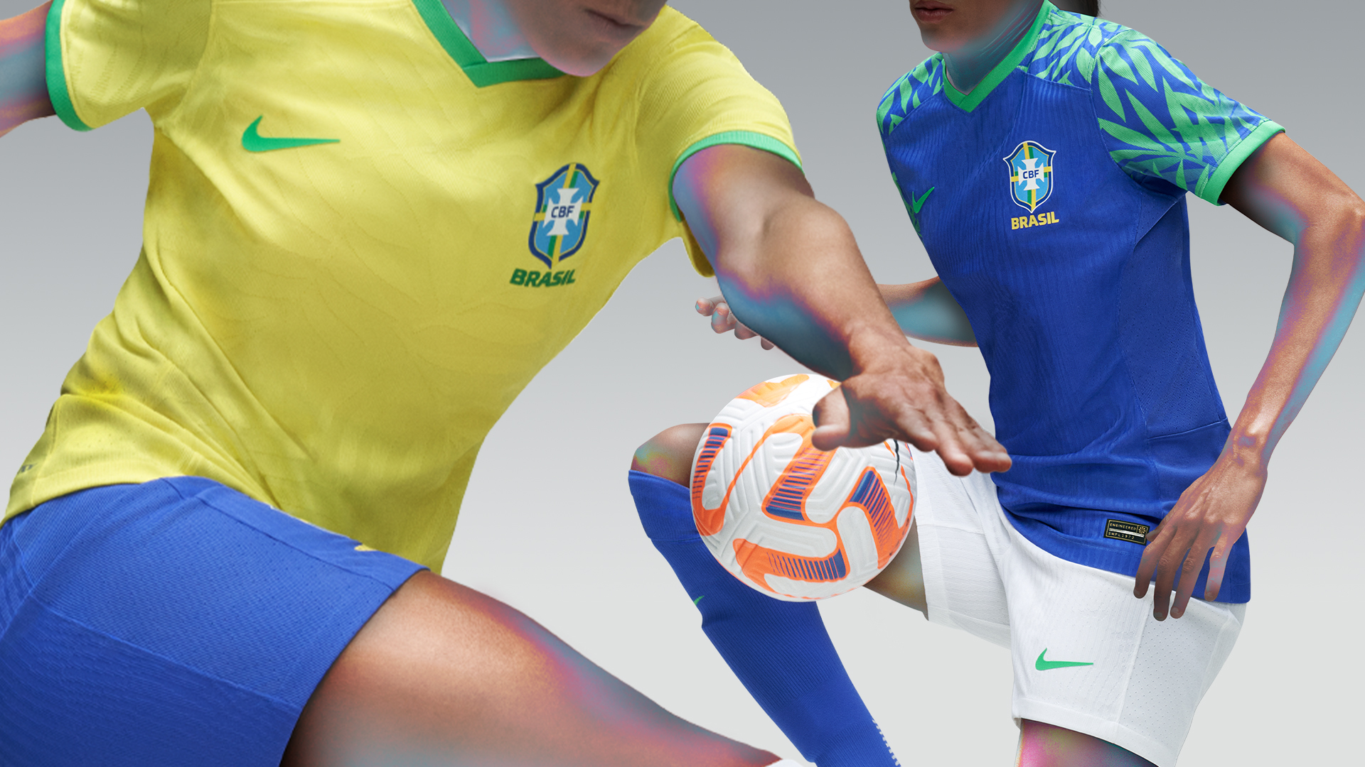
One of the most iconic kit designs in all international football has been dialled up to 11 with the famous Selecao yellow looking brighter and livelier than ever thanks to a subtle foliage pattern inspired by the canopies of the Amazon rainforest. It’s simple, effective and brings an enduring classic bang up to date.
Meanwhile, the lush blue away kit continues the jungle theme, with a neon-green leaf pattern printed across the shoulders and down the sleeves on a jersey that is a rich, deep blue. Totally tropical.
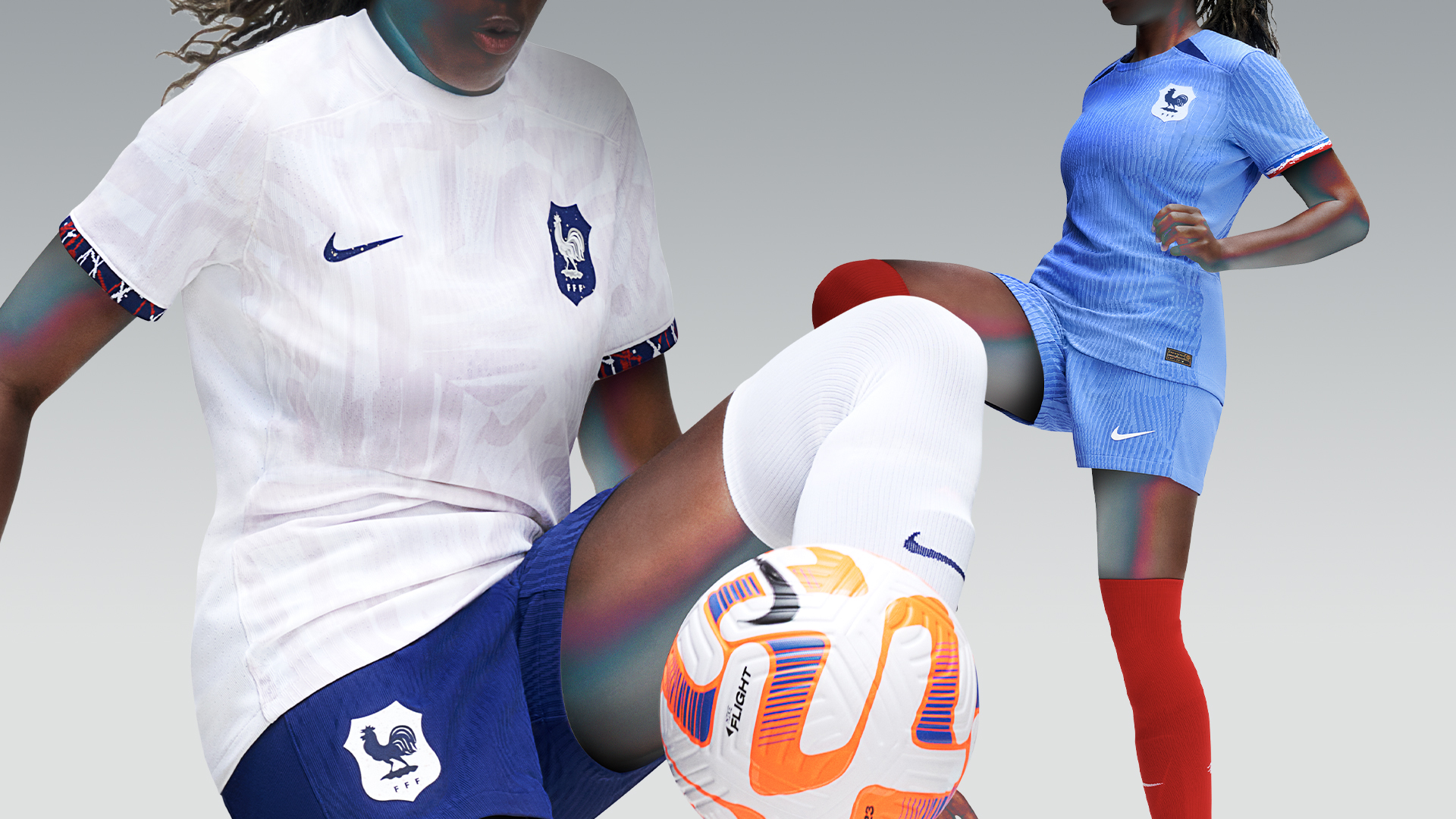
Classic art movements have provided the inspiration for several of Nike’s World Cup offerings, and France’s are the piece de resistance. Both kit designs are influenced by Orphism, an abstract art movement that became popular in the 1920s, which is also when the first French women’s football teams were formed. The home shirt is a much lighter shade of blue than Les Bleues‘ usual tone, with lilac overtones added by a subtle weave effect in the fabric that gives the impression of natural brushstrokes.
The white away jersey has a prominent pattern meant to replicate the swirling shapes, grids and Cubist-esque lines associated with the Orphism movement. The tricolore on the sleeve cuffs of both jerseys is rendered in a brushstroke style, while similar flecks of white can also be seen on the crest of the away kit.
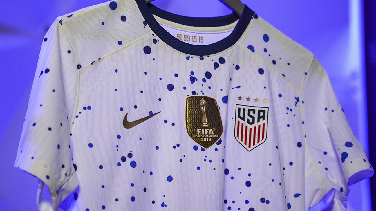
Nike has tried something commendably unconventional with the kit that the USWNT hope to be wearing if they achieve a World Cup three-peat. Inspired by the abstract expression art movements popularised in 1940s New York — think Jackson Pollock, Mark Rothko et al. it’s a crisp white “canvas” covered in blue blobs and paint spots that create a random speckled pattern. Unusual, tasteful and still dripping (quite literally) in patriotic cool.
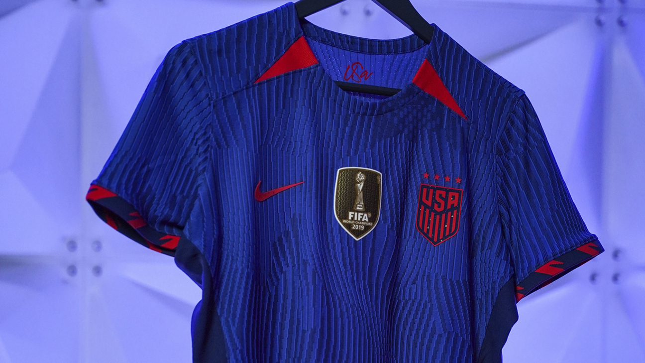
The away kit is far sleeker but still distinctive, with a ribbed graphic lending the blue shirt a sense of perpetual movement. The jagged pattern in bright red on the sleeve cuffs and in two-tone blue on the socks adds dynamic flourish. With back-to-back World Cup titles to defend, the USWNT will certainly look like champions as they set out to make history.
Images courtesy of Adidas, FIFA, Nike, Puma
