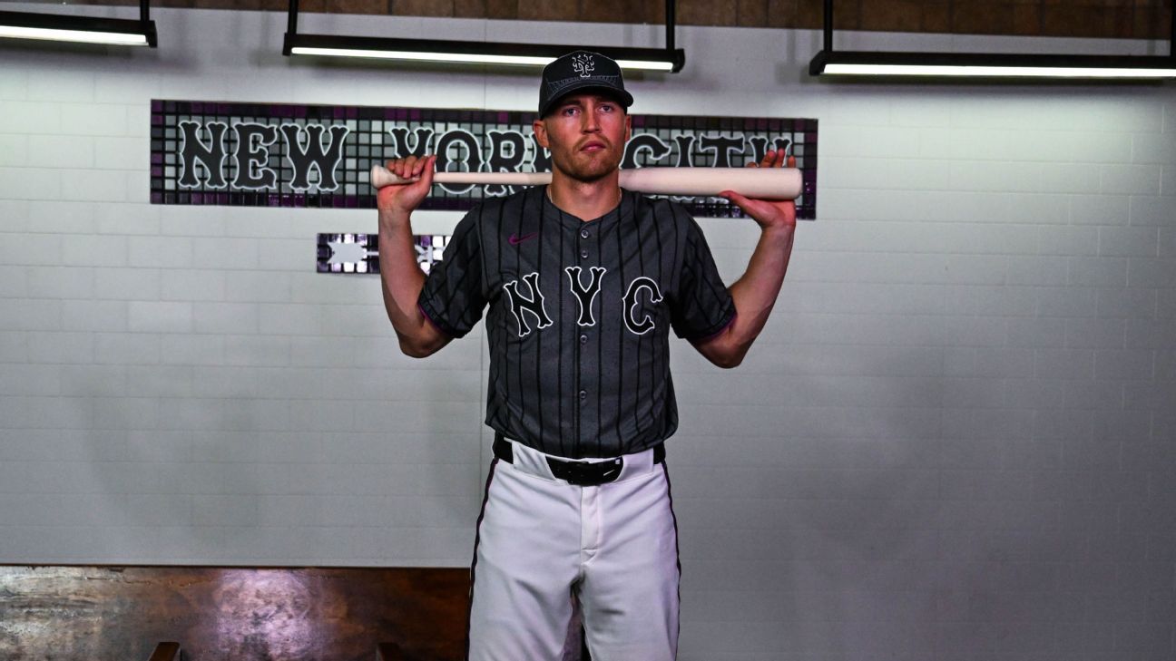
The New York Mets unveiled their City Connect uniforms on Friday.
The look will debut on April 27 against the St. Louis Cardinals and will be worn on every Saturday home game, excluding Darryl Strawberry’s jersey retirement on June 1.
The inspiration of the uniform relates to the “concrete jungle, the strength and grit” that is the fabric of New York and a “city like no other,” according to the Mets press release. The color of the uniform is also a nod to the concrete jungle.
Mets Chief Marketing Officer Andy Goldberg told ESPN that placing “NYC” across the chest was a deliberate move because the franchise hopes to connect to the whole city, rather than just one area. The font of “NYC” is the classic road jersey one. In Goldberg’s mind, this wasn’t another Mets uniform, but one that was their own and brought life to what the city means to the franchise.
“We are out in Queens. We have a different history than everyone else compared to the other teams. So we just wanted to capture the city the best way we could,” Goldberg said. “And we have this sort of like, really, really passionate fan base that, you know, they want to see this. They want to wear this with pride, and we want them to wear this with pride.”
The jersey’s typical pinstripes are instead the circles and diamonds that make up the subway system. The sleeve patch is inspired by the city’s subway token. Included behind a “New York City” on the inside of the cap is New York City’s train system, which connects the five boroughs. It’s similar to how the Baltimore Orioles designed the inside of their uniforms to highlight the city’s arts and culture.
However, one of the more anticipated aspects of the design leading up to the reveal was the Mets’ use of purple. It serves as a nod to the 7-Line, which is represented by a splash of the color throughout. According to the press release, the Mets described the 7-line as the “one train that represents all New Yorkers equally and brings you to our home.”
Goldberg said they took swatches of purple and went to different stations, holding it against the 7-line.
“We wanted to get the right one, but also one that felt right for the jersey,” Goldberg said. “There were a lot of different elements and challenges. But I think in the end, everyone here, it wasn’t about convincing people it was right. When they see it, they’re like, that is exactly what we should be wearing.”
One of those aforementioned different elements is the silhouette of the Queensboro Bridge on the hat and the steel structure on the sleeve.
The process of designing began in December 2021. The Mets went through 20 to 30 different looks, some of which were “fundamentally different designs.”
Goldberg said once the design was finalized last summer, they sat down with Brandon Nimmo and Francisco Lindor and explained it. During spring training, more players saw the look and “absolutely loved it.”
“Their eyes [popped] out of their head and going wow. Like that was the biggest they couldn’t wait to wear it … I think they really like it,” Goldberg said. “They feel comfortable in it. They love how it represents New York. They just, they love the look.”
